Kids Atelier: The Case Study
The Challenge
A children's clothing retailer, originally Catimini USA, went through a complete rebranding in April 2017. They were no longer going to carry the Catimini brand and instead would carry between 8-12 brands as a curated collection. So not only did they need a completely new name and concept, they needed to retain current customers and shift the target market for new ones.
Constraints:
Navigation change to account for more brands and product categories
Finding a link between the curated brands to make a cohesive voice for content and visual design
Mobile usage jumped from 45% to 70%
Research
Competetive Analysis:
The following brands are competitors in the field. Kids Around represents our sister company in France which we adapted for the U.S. market. The others are much larger in scale with many more international brands than we have, so we will have to adapt what we can learn from them for a smaller boutique while still making it scalable.
Key Objectives:
Simplified browsing and checkout
Change in navigation to account for many brands and categories
Ramp up the content marketing and curated showcase collections
Flexible and scalable site
Target Market:
Gender: Female
Age: 30-40 years
Income: 100k+
Family: Married with kids
Occupation: Business/Fashion/Full-time Mom
Education: College
Tech savviness: Mid
Pain points of the users:
She doesn't have much time for her love for shopping. She is either on a break at work or in between juggling a family and all the to-dos, which is why she must shop on her mobile device- it's always with her.
Key Features
Collection Pages
Easy to navigate and filter as well as lazy loading and optimized images responsive to all screen sizes.
Cart & Checkout
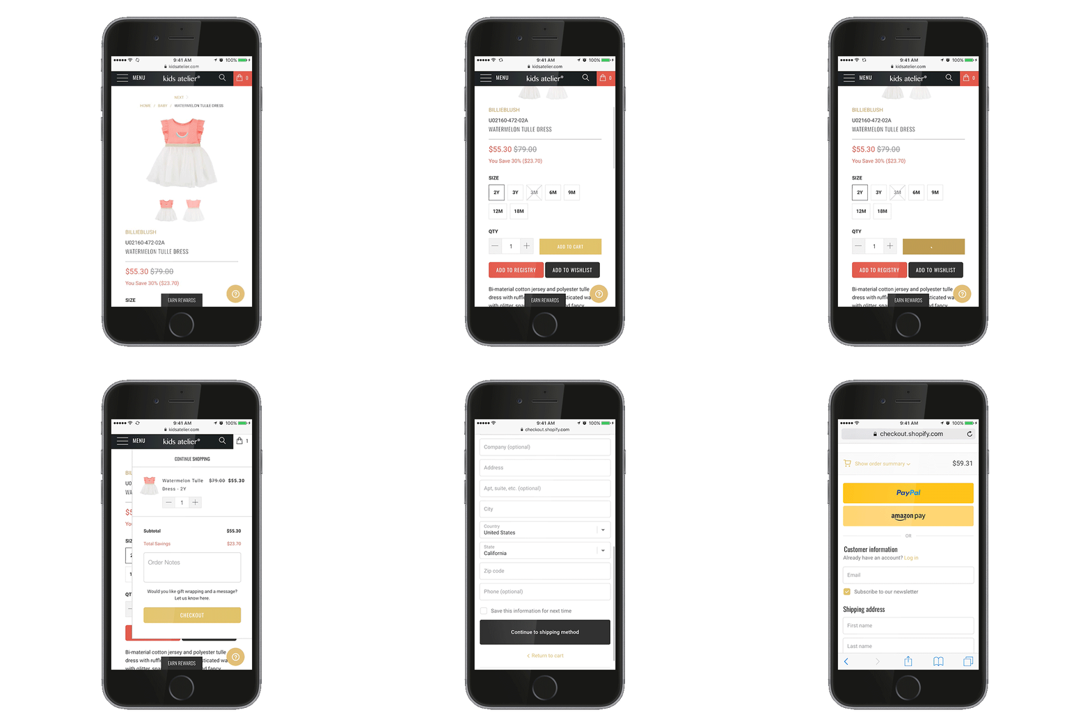
Animated, interactive mini cart. Easy Checkout with Paypal, Amazon, or credit card.
Shoppable Lookbook
The lookbook is pulling selected images from our Instagram feed and we can link them to items in the shop with an immediate 'add to cart' function and easy navigation back or next.
Mega Menu
We have so many ways to sort through our shopping selections, but a primary focus for our audience is baby clothes. People want visual cues to get to what they need easily for their little girl or boy.
Designers Page
To highlight the curated collection of these international brands across the spectrum of styles from creative bohemian to classic chic.
SEE IT LIVE @ kidsatelier.com


