


Dashboards are everywhere—from banking apps to project management tools—but not all of them are easy to use. Some are packed with charts and metrics that look impressive but leave users wondering, "What am I actually supposed to do with this?"
A great dashboard isn't about showing more data. It's about helping people understand what matters and make decisions faster.
Here are a few principles I keep in mind whenever I design a dashboard.
Before thinking about charts or KPIs, I always ask:
For a freelancer, that might be:
"How much money can I safely spend this month?"
For a project manager:
"What needs my attention today?"
The dashboard should answer those questions first.
Not everything deserves equal attention. The most important information should be the first thing users see. Everything else should support it, not compete with it. Good spacing, clear typography, and a strong visual hierarchy go a long way toward making a dashboard feel intuitive.
It's tempting to include every metric available, but that usually creates clutter. Instead, focus on what users actually need. Group related information together, remove anything unnecessary, and don't be afraid of white space. Simple dashboards are often the easiest to use.
A number by itself doesn't tell much of a story.
Instead of showing:
Revenue: $42,580
Try:
Revenue: $42,580
⬆️ Up 18% from last month
Even better, explain why it matters. Context helps users make decisions instead of forcing them to interpret the data themselves.
A dashboard shouldn't be the end of the journey. If users spot a problem, they should immediately know what to do next. Whether it's reviewing an invoice, assigning a task, or approving a request, the next step should feel obvious.
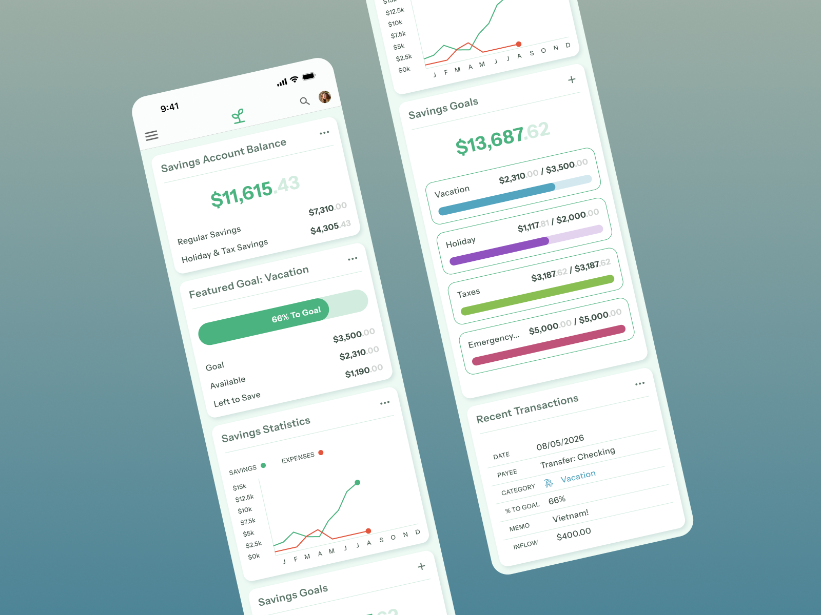
A dashboard that works beautifully on desktop can quickly become frustrating on a phone. On smaller screens, I like to simplify the layout, stack content vertically, and prioritize the information users need most. Responsive design isn't just about resizing—it's about rethinking the experience.
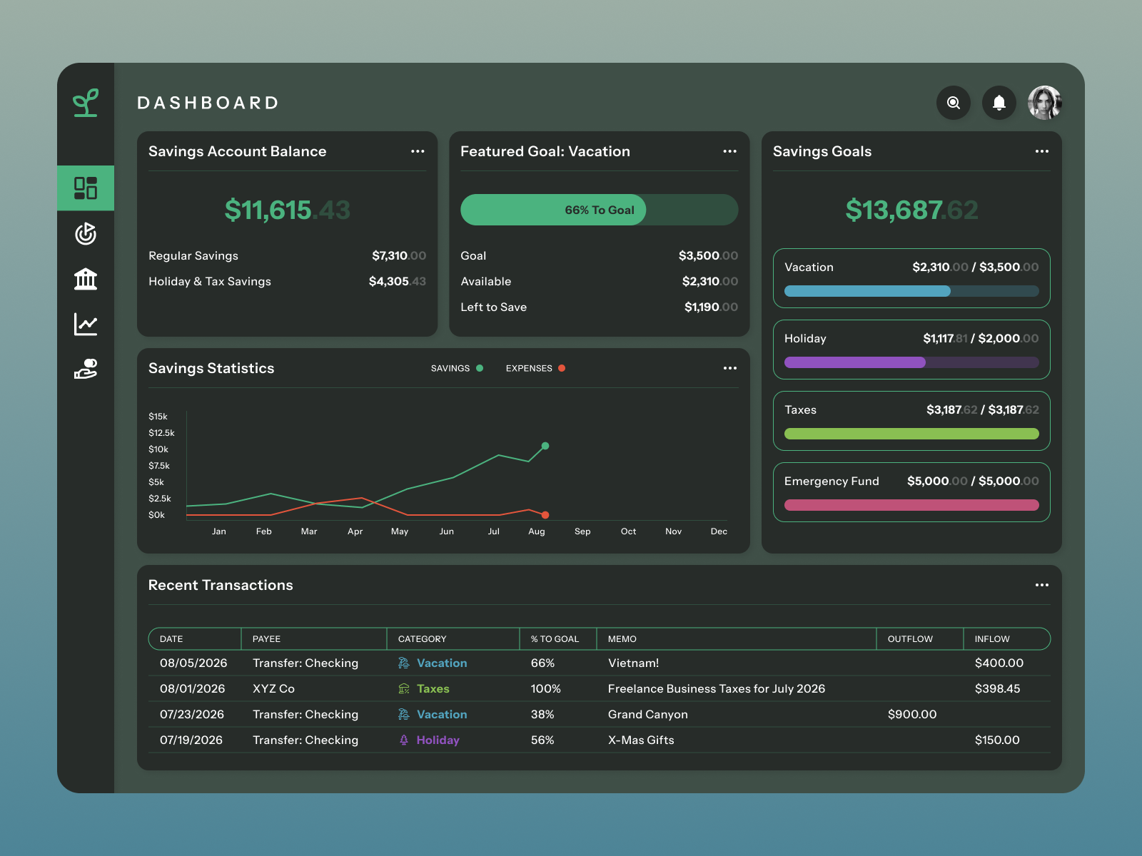
Good accessibility benefits everyone. Clear labels, strong color contrast, keyboard navigation, and thoughtful use of color all make dashboards easier to understand and more inclusive.
These are the same principles I used while designing Avail, where the goal wasn't simply to show financial data—it was to help freelancers understand how much money they could actually spend. I followed a similar approach with Sprout (below), focusing on helping users quickly identify issues and take action without feeling overwhelmed. Different products, same design philosophy: make the important things easy to find.
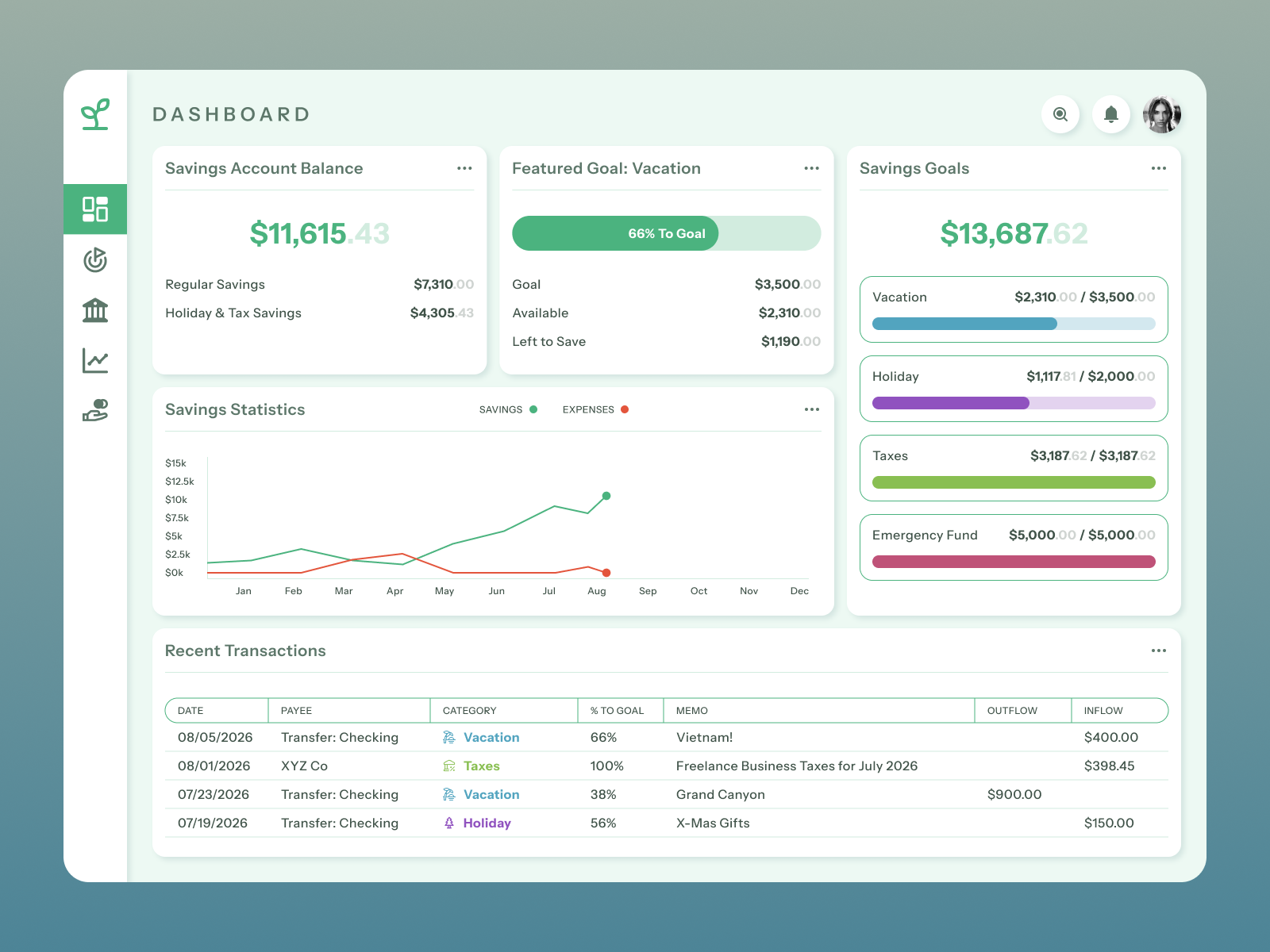
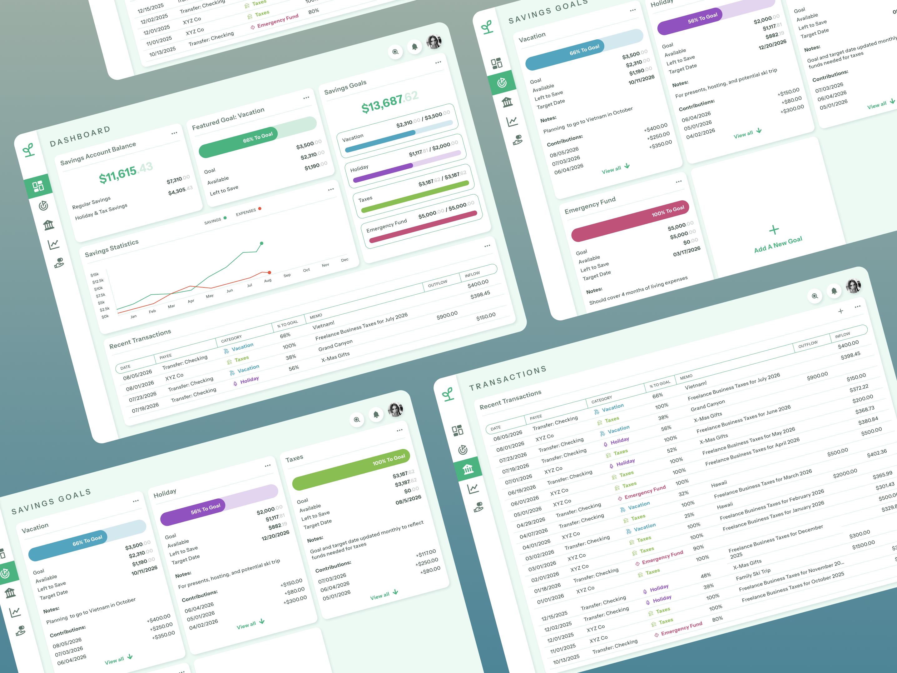
At the end of the day, the best dashboards aren't the ones with the most charts—they're the ones people enjoy using. When you focus on user goals, simplify the interface, and give information the right amount of context, dashboards become tools that help people make better decisions instead of slowing them down.


