



To create a responsive web app for finding recipes and planning meals to help busy people with weekly meal planning and shopping.
People who cook at home at least a few times a week who like to plan meals and create shopping lists with others. They may have dietary restrictions and different cuisine preferences or cultural food backgrounds.
The user’s primary goals are to search for recipes and create a shareable shopping list for meal planning.
The audience will use it at home in the kitchen or out shopping for groceries with their computer or phone.
They will use it whenever they feel like planning for a meal and before shopping, as well as during the meal prepping or cooking time.
The audience likes an easy way to plan for meals, get inspiration for recipes, and organize a shopping list. This person is usually the type who likes to be organized in the digital space.
The user’s primary goals are achieved through the clearest CTAs or pages within the webapp.

I created user personas based on real people that I know who have certain goals and frustrations surrounding recipe searching and meal planning.
You can view the user personas in more detail here.

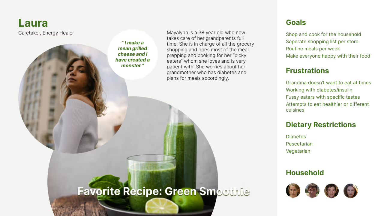
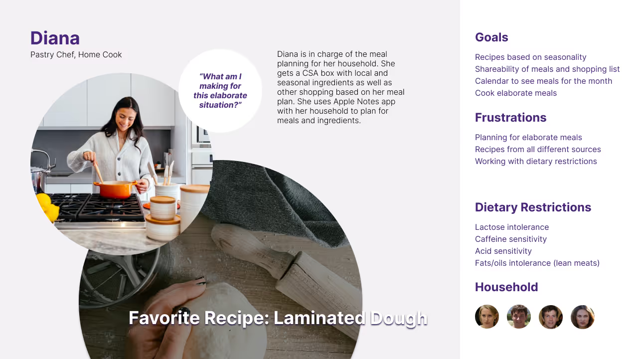
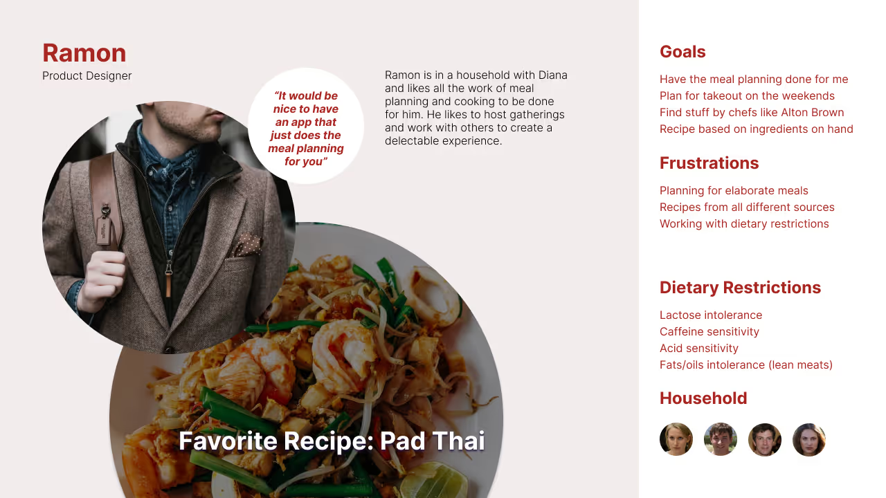

To create a responsive web app for meal planning that meets the goals and needs of users that other apps do not. Some of the users I want to target are those with medical conditions who require specific diet protocols and the people who support them.


Based on the Jobs to be Done from MVP #1 I created 5 different user flows which I have combined here to map out my thought processes. This allowed me to refine navigation and get all the necessary features for the product.
You can view the full document and individual flows here.

Low fidelity wireframes were sketched out to get a better idea of how features and essential functions would look on a mobile screen.


Although both mood boards are viable for this project, I will continue designing the light version. I think it’s more friendly and approachable and will appeal to a larger audience. I also think it’s likely that it will be easier to read. With enough time I would like to design both or at least get a few of the main screens designed in dark mode as well.


I found that testing with just the wireframe sketches made it challenging for those testing the product so I brought my sketches directly into Figma for a better prototyping experience. Below are some of the main screens.
View the prototypes


For maintaining consistency across the product I created a style guide.


Testing the primary flows for the MVP 1 resulted in discovery of some errors that are rated based on Jakob Nielson’s error severity rating system. 4 being imperitive to fix before the product is released.


A glimpse into how things turned out. What went well, what didn’t go well, and ways to improve.
Initial research on competitors
Spending too much time on certain documents rather than creating an experience
Iterate in a visual way while doing the research. Things may change and that okay but it’s best to get something in front of people quickly to see if it’s a worthwhile product


